- 2018-04-26
- Projects
- #machine learning, #python, #statistics, #dataviz
Determining the Best ML Algorithm to Predict the Iris Flowers Dataset
This is my first machine learning project, completed end-to-end using this tutorial from Machine Learning Mastery. The project was a way for me to get out of my head and into the practical world of machine learning; namely, instead of taking more and more courses and reading more and more books, this was a way for me to finally get out and try some of those things I'd been learning for myself.
Directory
Click the section you would like to jump to:
- Description
- Data
- Discovery Data sources.
- Download Collection process.
- Dissection Data analysis.
- Deploy
- Division Separate the data.
- Decision Choose the best model.
- Divination Make predictions.
- Discussion
- Debug Mistakes were made.
- Directions Ideas for future research.
- Disseminate
Description
I used Python and its built-in machine learning capabilities to work through the iris flowers dataset. The project was stepped-through with the help of a tutorial on Machine Learning Mastery.
I was curious to see if I could implement a full-blown machine learning project on my own, using just what I'd learned so far through the courses I'd taken previously. During the course of the project, I also came up with a question I wanted to answer:
- Are the KNN and CART algorithms equally accurate at making predictions?
Data
Discovery
The Iris flower dataset is readily available.
Download
The dataset was loaded directly into the console using the following code:
url = "https://archive.ics.uci.edu/ml/machine-learning-databases/iris/iris.data"
names = ['sepal-length', 'sepal-width', 'petal-length', 'petal-width', 'class']
dataset = pandas.read_csv(url, names=names)
Dissection
I used various means to visualize our data and get a better understanding of it.
Dimensions
First, we determined what the data itself looked like. How many rows (instances/examples) and columns (features or attributes) are there? I used dataset.shape and found 150 rows corresponding to 150 flowers in the dataset.
There were also 5 columns. From what I knew of machine learning (and the way I had loaded the data previously), I could guess more accurately that 4 of them were features and the fifth column was the class of each flower, belonging to one of three possible classes.
First Look
After getting the size of the dataset, I used dataset.head to take a look at the actual data itself.
This was where I learned that the data was zero-indexed, with the first example numbered 0 and the last one numbered 149. This was different from what I’d learned up to this point in Octave, where everything was indexed from 1. Regardless, from taking this quick look I could already see two of the flower classes: Iris setosa and Iris virginica. I wondered what the last one was!
Stats
I used dataset.describe to look at the descriptive statistics for the four features:
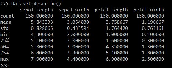
There were indeed 150 examples, and the output showed the mean, standard deviation, max and min for each feature.
Dr. Brownlee also noted that all features have a similar scale and range. I remembered from Andrew Ng's course that it's important to note the scale of your features in case you need to normalize the data.
Class Distribution
I discovered how many examples were in each class by using dataset.groupby('class').size(). From this we could see that the third class was Iris-versicolor. There were exactly 50 flowers in each class.
Visualization
After I'd gotten a good grasp of the data, it was time to visualize it to get an even better understanding of what I was working with.
This step helped me to determine if there were any relationships between the data that could be predicted in the first place.

Code used to generate a box plot.
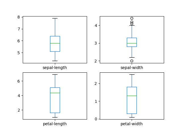
Iris flower boxplots.
I much prefer histograms, so that's what I visualized next:

Code used to generate histograms.
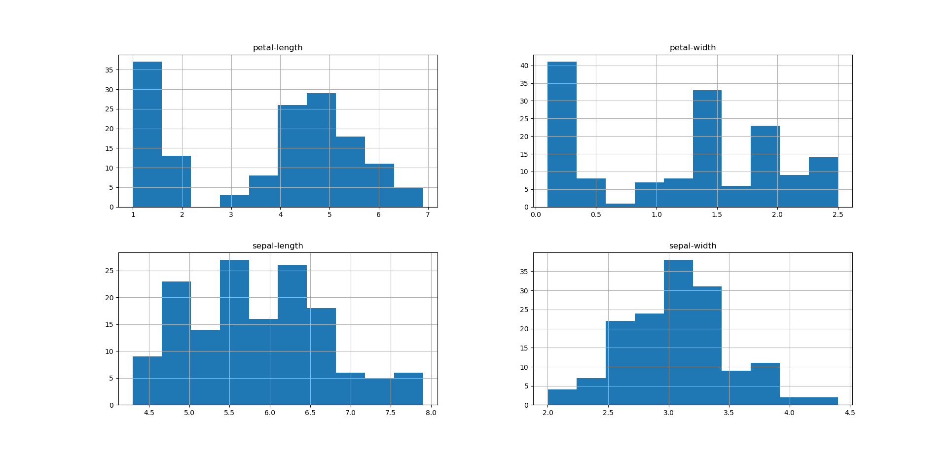
Iris flower histograms. Dr. Brownlee notes that two of the attributes (namely sepal-length and sepal-width) appear to follow the normal distribution, and that we’ll be able to “exploit this assumption” through our algorithms.

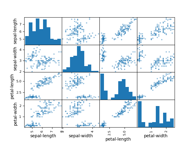
Scatterplots pairing all possible features. I noted quite a few linear correlations, most notably between sepal-length/petal-length, petal-width/petal-length, petal-length/sepal-length and petal-length/petal-width.
Dr. Brownlee corroborated my finding: noting “the diagonal grouping of some pairs of attributes.” This meant they were highly correlated, and we could possibly predict these relationships very well using machine learning!
Deploy
Division
In Andrew Ng's course, I learned to always split the data into training/validation/test sets, with a minimum train/test split.
I’m going to follow this tutorial and do an 80-20 train/test set, but I look forwarding to trying the 3-fold split in the future. After running the provided code, data is split into X_train, Y_train, X_validation and Y_validation.
Decision
We don’t know which algorithms would be good on this problem or what configurations to use. We get an idea from the plots that some of the classes are partially linearly separable in some dimensions, so we are expecting generally good results.
We needed to evaluate lots of different learning algorithms to see which one would give us the best chance of predictions. We looked at the following six:
- Logistic Regression
- Linear Discriminant Analysis
- K-Nearest Neighbors
- Classification and Regression Trees
- Gaussian Naïve Bayes
- Support Vector Machines
I learned about most of these through Andrew Ng’s course, and the rest through the Machine Learning Guide podcast. I was excited to finally try them out!
The code to build and evaluate these algorithms are deceptively simple. When I took Andrew Ng's course, I had to build them all from scratch. There were pages upon pages of code, all inter-related to one another, and if I messed something up in one document it would wreak havoc in another. This is so easy! As Python is known for, just plug-and-play ;)
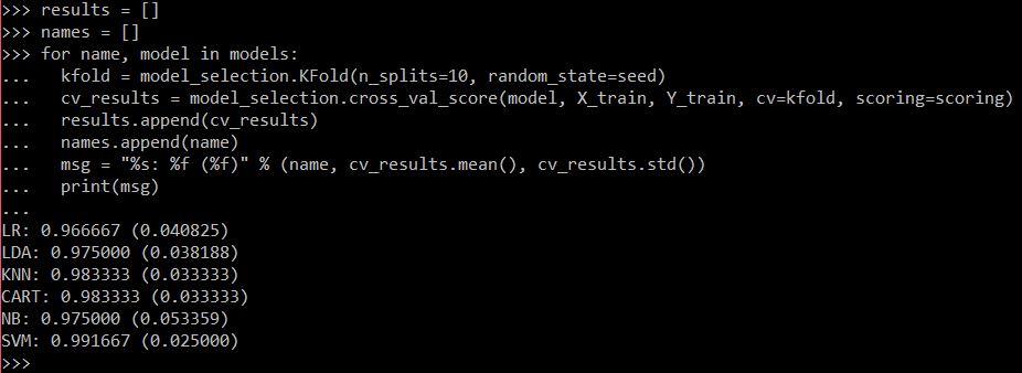
Model evaluation.
From Dr. Brownlee’s article, KNN was the best model by far, but my evaluation puts KNN at the same accuracy as CART. He said you could also plot the evaluation results, which might help differentiate the two. So I tried that next:
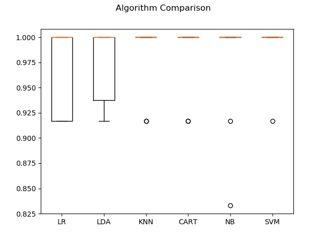
Second model evaluation.
...It didn't help much. Apparently all of the models do pretty well on this dataset. So I followed the tutorial and went with KNN.
Divination
KNN
We can run the KNN model directly on the validation set and summarize the results as a final accuracy score, a confusion matrix and a classification report.
After copying his code, this is what I got:
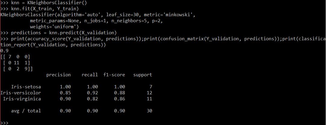
KNN prediction accuracy.
Same as the tutorial! An accuracy of 90% for KNN.
Breakaway: CART
So I got that CART is about the same accuracy as KNN. I'll admit, I wasn't satisfied with simply following the tutorial and stopping here. So I went ahead and tried to run the same code with a decision tree to see if I could get similar predictions:
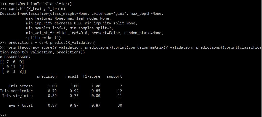
Decision tree prediction accuracy.
This was not what I had expected at all! Since they'd received a similar score on the evaluation metric, I had assumed the decision tree would perform just as well as—or perhaps even better than—KNN. It appears that the decision tree algorithm actually does perform worse than KNN, with an accuracy of only 87%. So it seems that, for the iris flowers dataset, KNN is the algorithm that gives the best predictions.
Discussion
I was nervous to start this project. I thought that doing an ML project from end-to-end meant sitting down and writing everything out first:
- What is the problem I want to solve?
- Where can I get the data?
- What algorithms am I going to use?...
I never thought I could just hack a problem together in an hour or so to get the basics down. But that’s exactly what I did here. Hopefully, I will be more aggressive about getting my hands dirty and actually playing around with what I can do in the future.
I was also excited that I came up with a problem and was able to answer it on my own! I saw that KNN and CART seemed to get the same accuracy score on the model evaluation, and I was able to adapt the code provided by the tutorial to check that out for myself. Very proud moment!
Debug
- I tried to print descriptive summary statistics using
describe. I forgot to put closing parentheses, like indataset.describe(). That fixed it right up. - Several times I tried to type new code into the console will a figure was still open. Every time I got confused as to why nothing was showing up. Hopefully in the future I’ll be able to remember to close those figures first when I'm ready to move on.
- I had trouble implementing a for-loop in the console. I always have to struggle through it until I get all the returns and indents right. But once I get the indents right I can figure it out just fine.
Directions
- Deepen my knowledge: The tutorial said we needed to "reset the random number seed before each run to ensure that the evaluation of each algorithm is performed using exactly the same data splits...[ensuring that] the results are directly comparable." I didn't quite understand why we needed to do this. Learn what "seed" is and what it’s used for, as well as what the test harness is.
- Gain a bit more independence: While I'm proud of myself and what I was able to accomplish in less than an hour this morning, I'd feel more confident knowing that I could construct these shell scripts on my own. To this end, work on small projects or tutorials that will help me understand how to write code on my own, especially for visualizing data.
